Andrew Goldstein: A Novel as Family Project

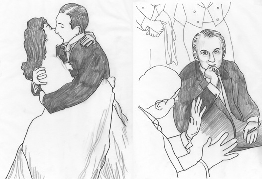
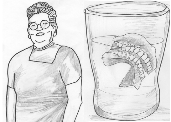
A while back, I mentioned Eric Orner’s art for his brother Peter’s novel, Love and Shame and Love. Recently, I saw a galley of Andrew Goldstein’s The Bookie’s Son, which also has drawings throughout the novel. In the acknowledgments, he mentions that these drawings are also a family affair, and I thought some of y’all might be interested in hearing about that, so I got in touch with his publicist and asked what he could tell us…
The other day, I was on the phone with a young woman at Book Baby and she said she loved the illustrations in The Bookie’s Son. She repeated this again later, which made me feel good since my daughter Lucy had drawn them. My original idea was to use real photos of my family even though the story is a fictional version of my childhood. I like the idea of mixing fact and fiction, memoir and novel, but at some point I chickened out. I decided that it might be too confusing for the reader, though I did use a real photo of my parents for the cover, which my son Max designed.
I use the illustrations at the beginning of each chapter. They are simple line drawings that were once more common in novels. The illustrations of people are based on family photos; there are also some drawings of physical objects and one racehorse. I debated the decision to use illustrations because one could argue that it is better for the reader to form their own impressions of what the main characters look like. I respect that perspective but in the end, for this novel, I decided the images added to the content.

During earlier drafts I had chapter headings, which I liked, but were unnecessary once I added the illustrations. The images do not always reflect the central theme or main character in the chapter. They serve more to convey a mood or hint at a person or action. One of their main functions is simply to be evocative without overshadowing the writing.
Two pleasant surprises: On a Kindle, the images create short-lived ghosts on the pages before and after, making them feel very animated. And having my daughter draw the images and my son design the cover and layout added an unforeseen joy to the whole enterprise, uniting the bookie’s son with his parents and children, his past and present.
19 May 2012 | guest authors |

 Our Endless and Proper Work is my new book with Belt Publishing about starting (and sticking to) a productive writing practice.
